TREATWELL
21 hours
Mobile
Solo project
Heuristic analysis
Figma
Redesigning the user interface of Treatwell mobile app to improve its functionality and aesthetic appeal, while translating a refreshed visual identity.
Summary
21 hours total duration :
6 hours : 1-3 Midfi wireframes clones using autolayout & 3 screens heuristics analysis
3 hours : Visual Competitive Analysis & suggested branding
12 hours : 3 Hifi wireframes & interactive prototype
The objective of this UI challenge was to redesign the user interface of a mobile application of my choice, without the requirement to conduct UX research. The only constraint was to select an app that could genuinely benefit from a UI overhaul - one that would improve both its functionality and aesthetic appeal, while also translating a refreshed visual identity. I chose the Treatwell application for this challenge.
As an occasional user of online beauty and wellness booking platforms, I found Treatwell’s app home page particularly disorganized and visually cluttered. The different sections lacked hierarchy and clarity, making navigation unintuitive and the overall experience frustrating. More importantly, I noticed a stark lack of graphic coherence between the mobile app and the visual identity presented on their website. This disconnect inspired me to propose a redesign that not only improves usability but also aligns more consistently with a modern, unified brand identity.
I then selected the 3 screens I could improve :
The homepage
The bookings page
The search filters page
Mid fi cloning
I started by making a clone of the home page, the longest one, as a medium-fidelity prototype. It enabled to understand how the content was structured, the order of the different sections, and to identify the different types of UI components to be improved.
Heuristics analysis
I then carried out a heuristic analysis, which enabled me to identify several levers for optimizing the user interface:
User control & freedom
Lack of contrast between content and background (ex : selected tab in menu bar…)
Some control CTA (ex : Close CTA) were not visible because overlapping an image
It was hard to distinguish the different types of CTAs (ex: filters versus cancel…)
Some important informations were missing (ex: salon address)
Aesthetics & minimalist design
Treatment categories cards were both over-sized and over-colored, which was overwhelming and implied unnecessary vertical scrolling
The text contents were too big or too small which reduced their visibility and legibility (ex: appointment date versus time, deals discount rates)
Consistency & standard
The color palette contained too many colors that are not necessarily linked with the content which created confusion (ex: treatments categories)
UI cards formats were heterogeneous and not rational (ex: Gift card versus Tw rewards card)
Visibility of system status
Lack of consistency between accent colors (ex: notifications icon, selected tabs for treatment categories…)
Mismatching icon and text label (ex: search in menu bar…)
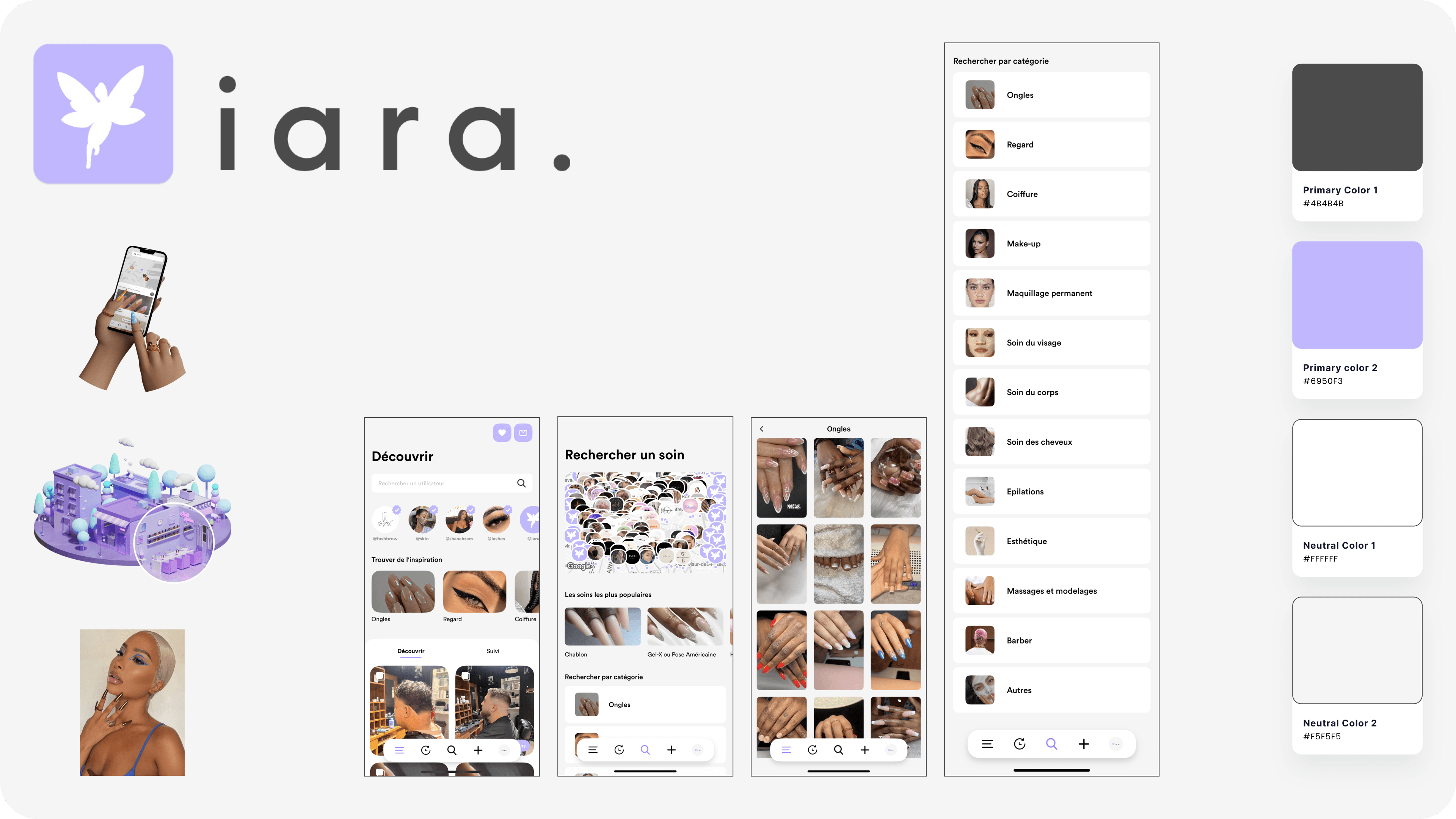
Next, I conducted a visual analysis of the user interface of 3 competitors to get an idea of industry standards and the branding gaps I could fill with my redesign challenge.
I chose the following 3 competing applications:
planity
fresha
iara
Analysing these competitors was instructive in deepening my creative choices, and documenting my proposal for a new visual identity.
Planity

Fresha

Iara
New branding
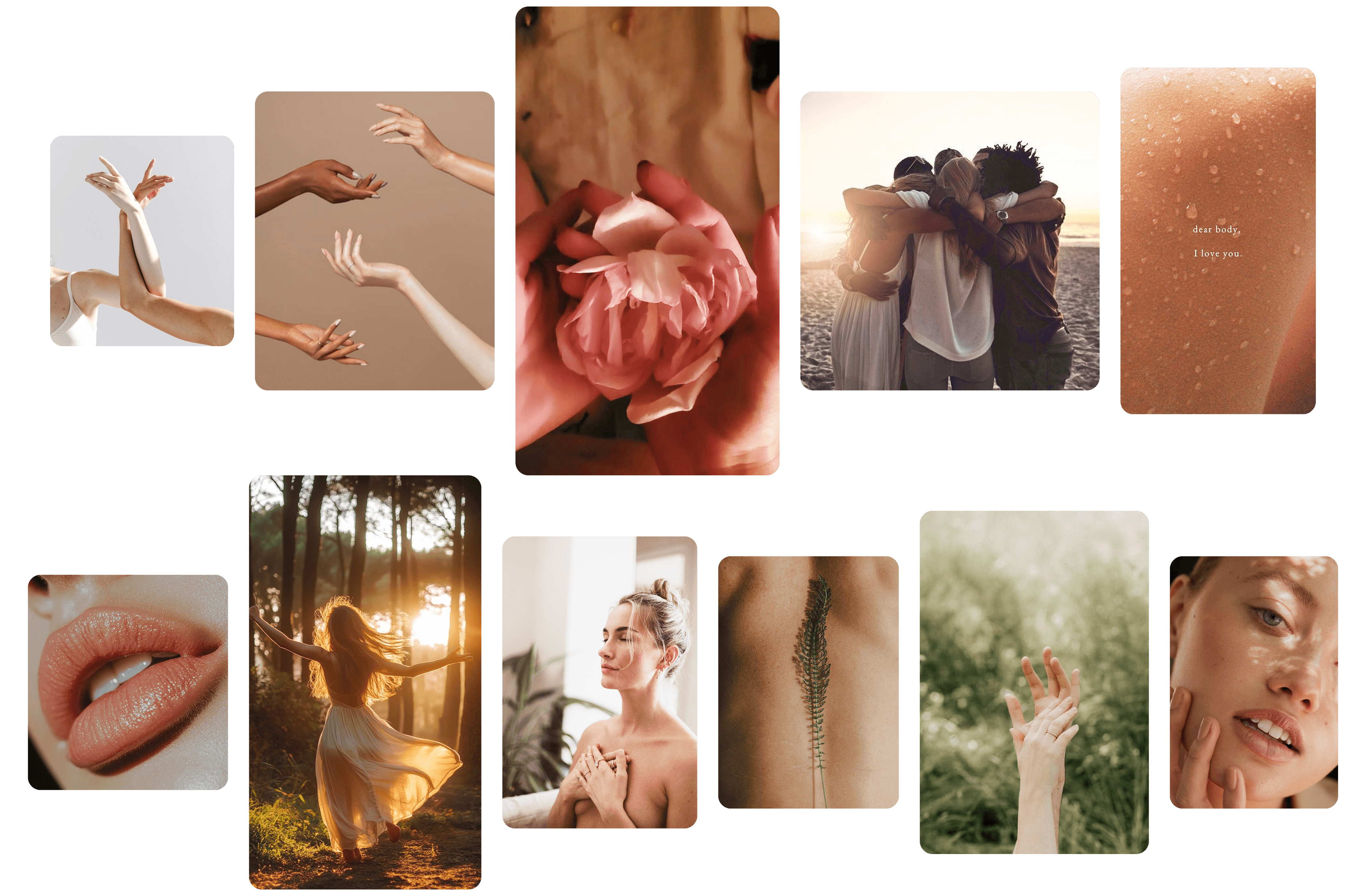
On the basis of this competitive analysis, I was able to define the priorities for this UI redesign and the brand attributes I wanted to convey through my new visual identity:
Sensuality
Self-confidence
Humanity
Naturalness
Inclusivity
Redesigned Color chart
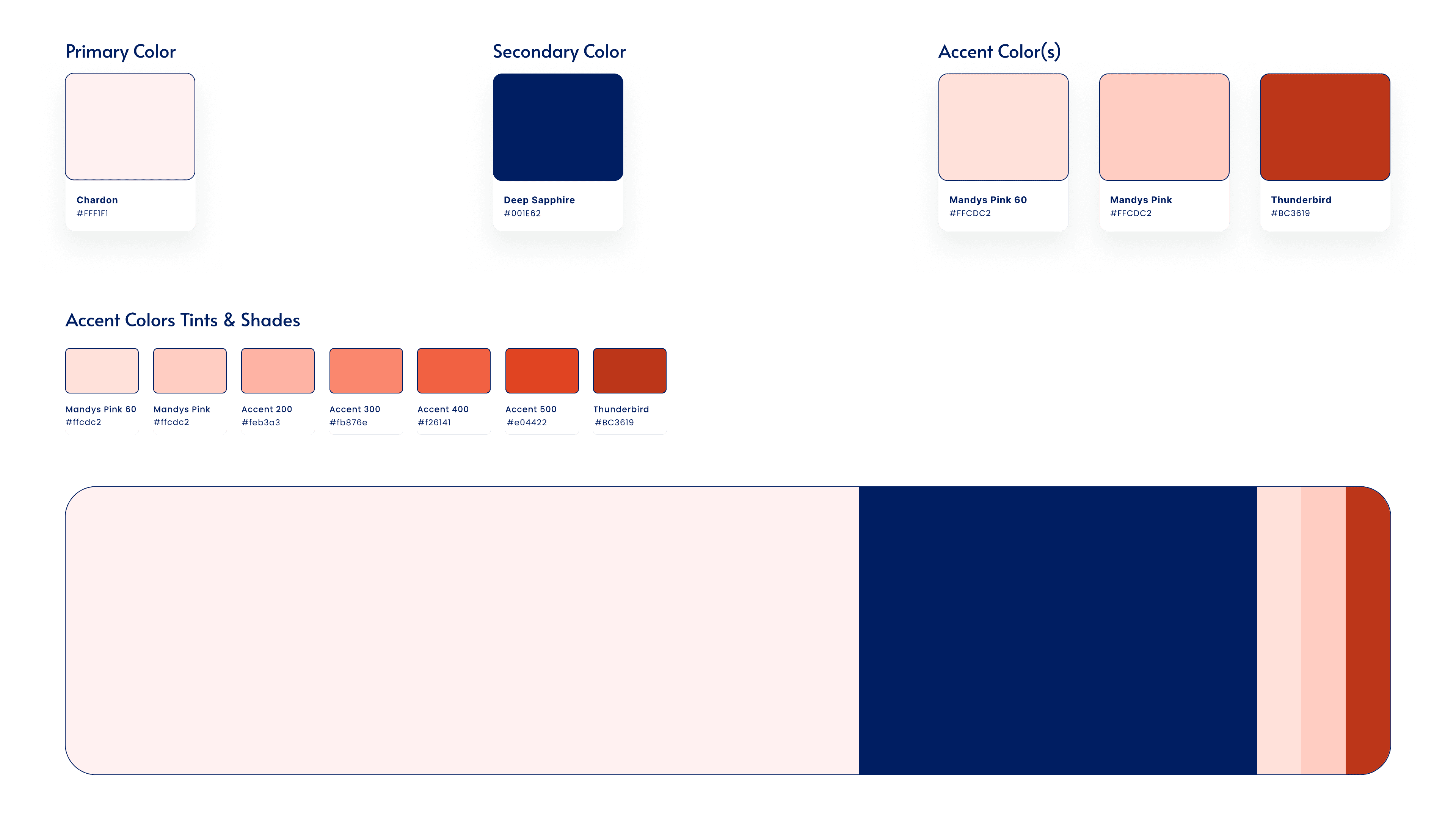
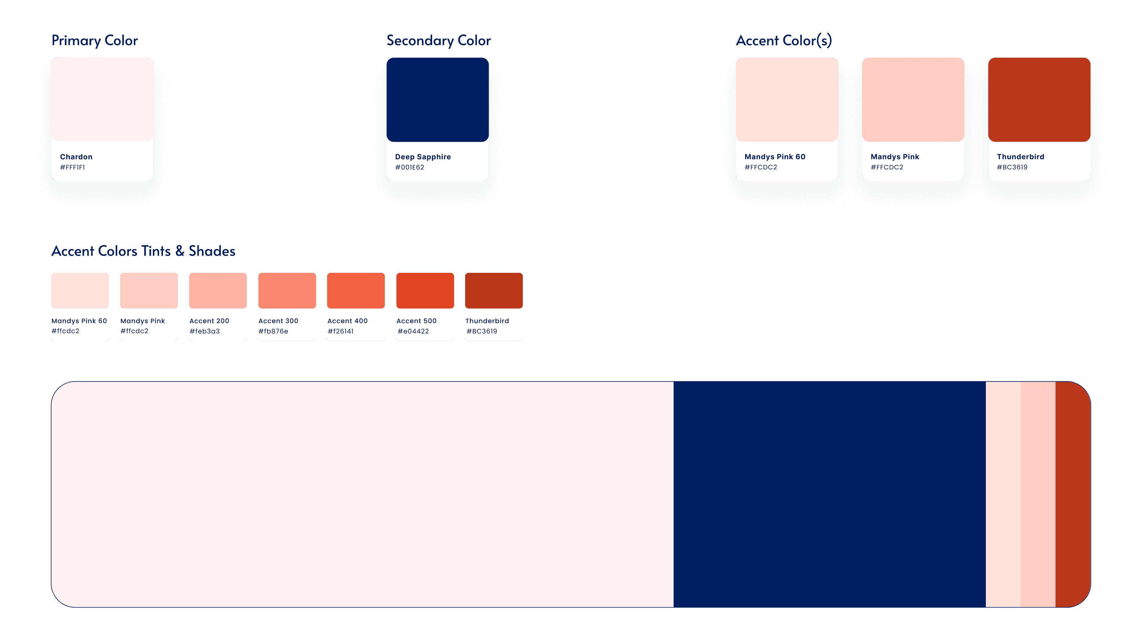
For my color selection, I particularly wanted to incorporate nude hues. I naturally chose pale pink as my main color and a neutral color at the same time, in keeping with the aspects of sensuality, naturalness and humanity.
I chose navy blue as a secondary color, as it embodies the dimension of confidence (especially in oneself) and contrasts with the rest of the palette. As accent colors, I chose a Mandys pink and a Thunderbird, in keeping with the logic of declining nude hues, inclusivity, and sensuality.
Redesigned Style Tiles
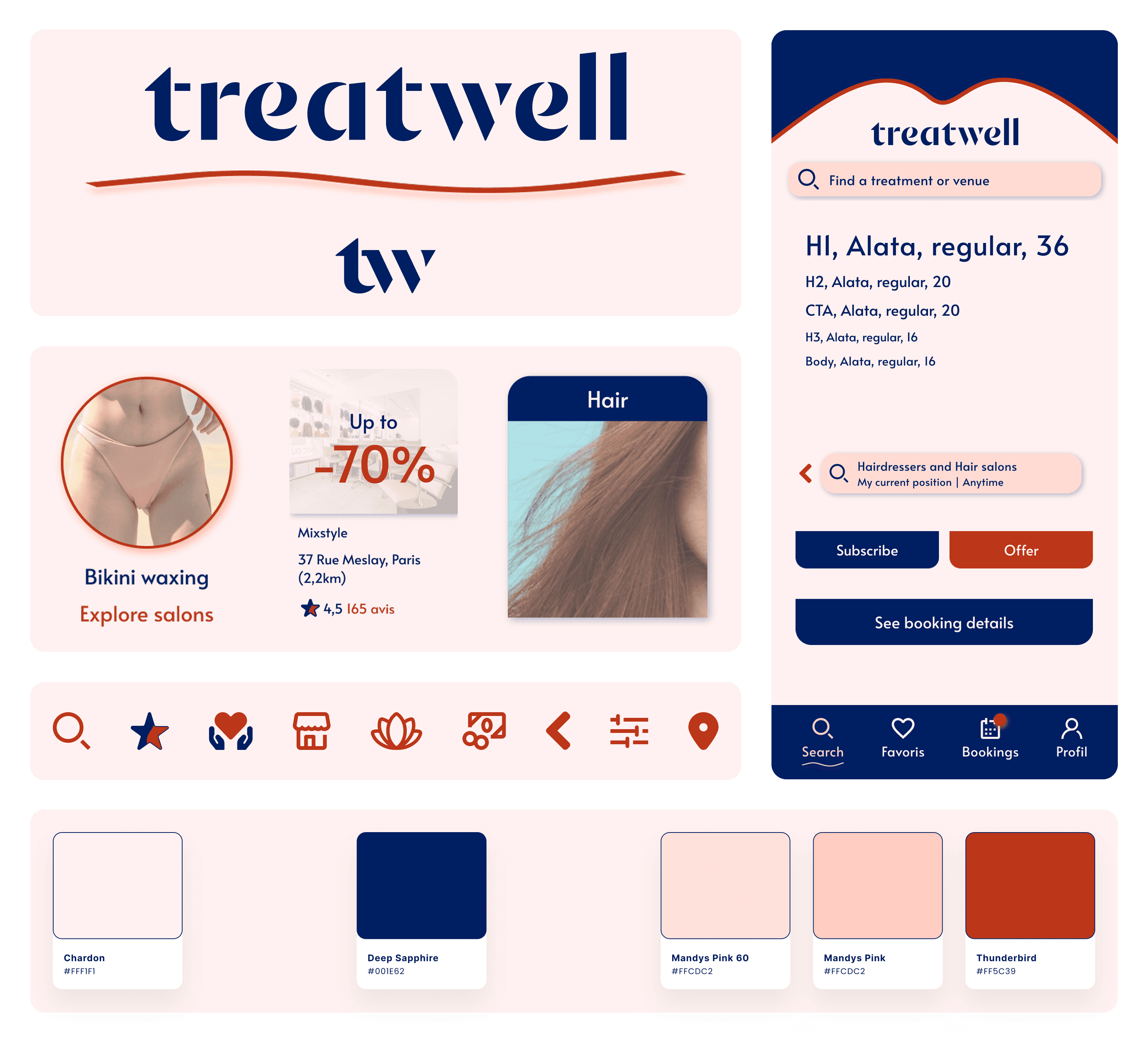
For the text, I chose the Alata font for its optimal legibility and its slightly rounded design, which gives it a soothing dimension in combination with the powder pink background.
I used certain codes from the visual identity deployed on the Treatwell website, notably certain colors and organic shapes reflecting the sensuality of bodies in motion, but in a less maximalist style to adapt to the reduced space on cell phones.
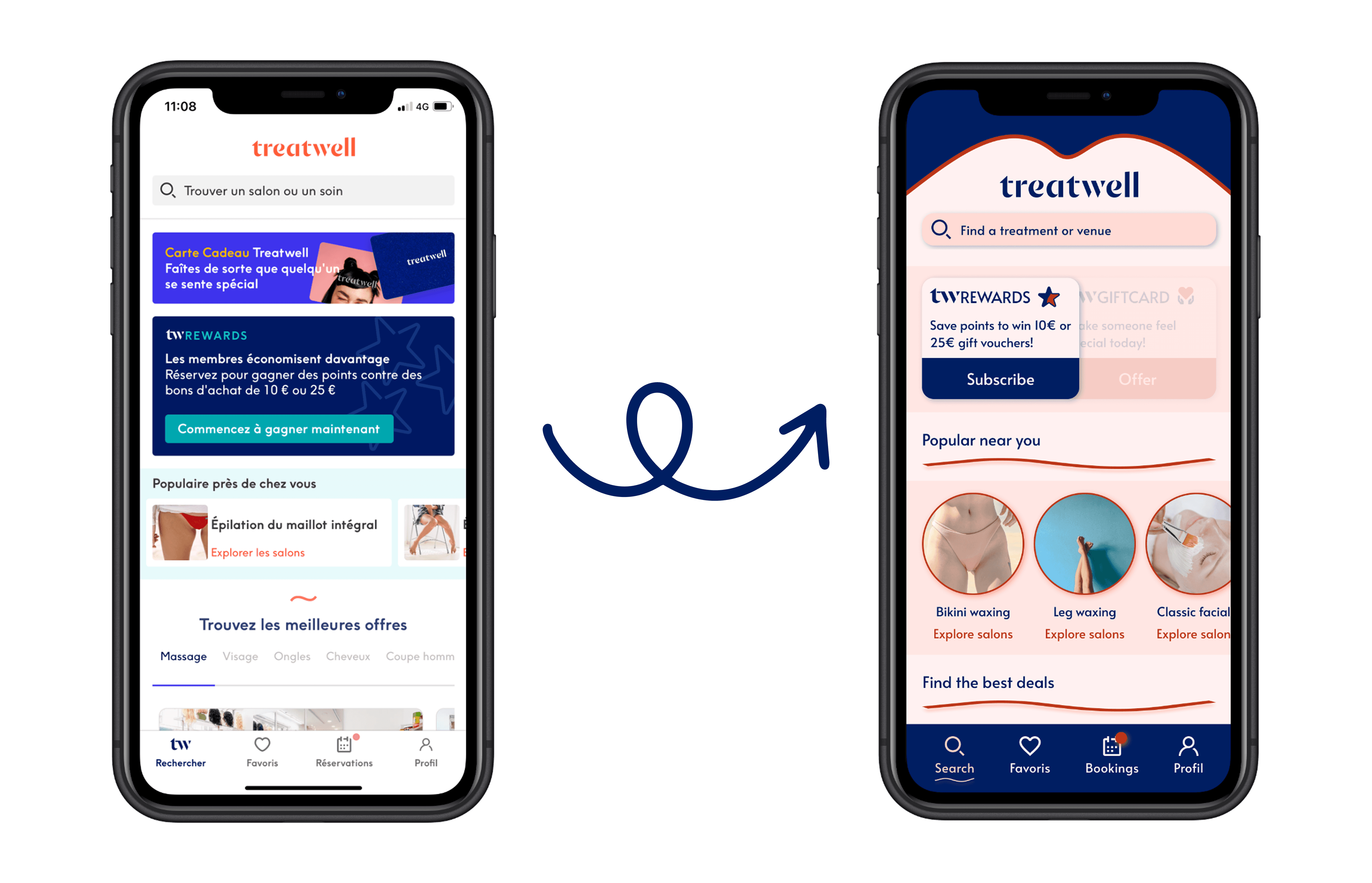
I chose to create a header with colored lines that evoke the shape of a mouth, with the aim of asserting Treatwell's identity, while creating a more immersive navigation. I also reworked the wave-shaped illustration, lightening it so that it could be used as a section divider without weighing down the space.
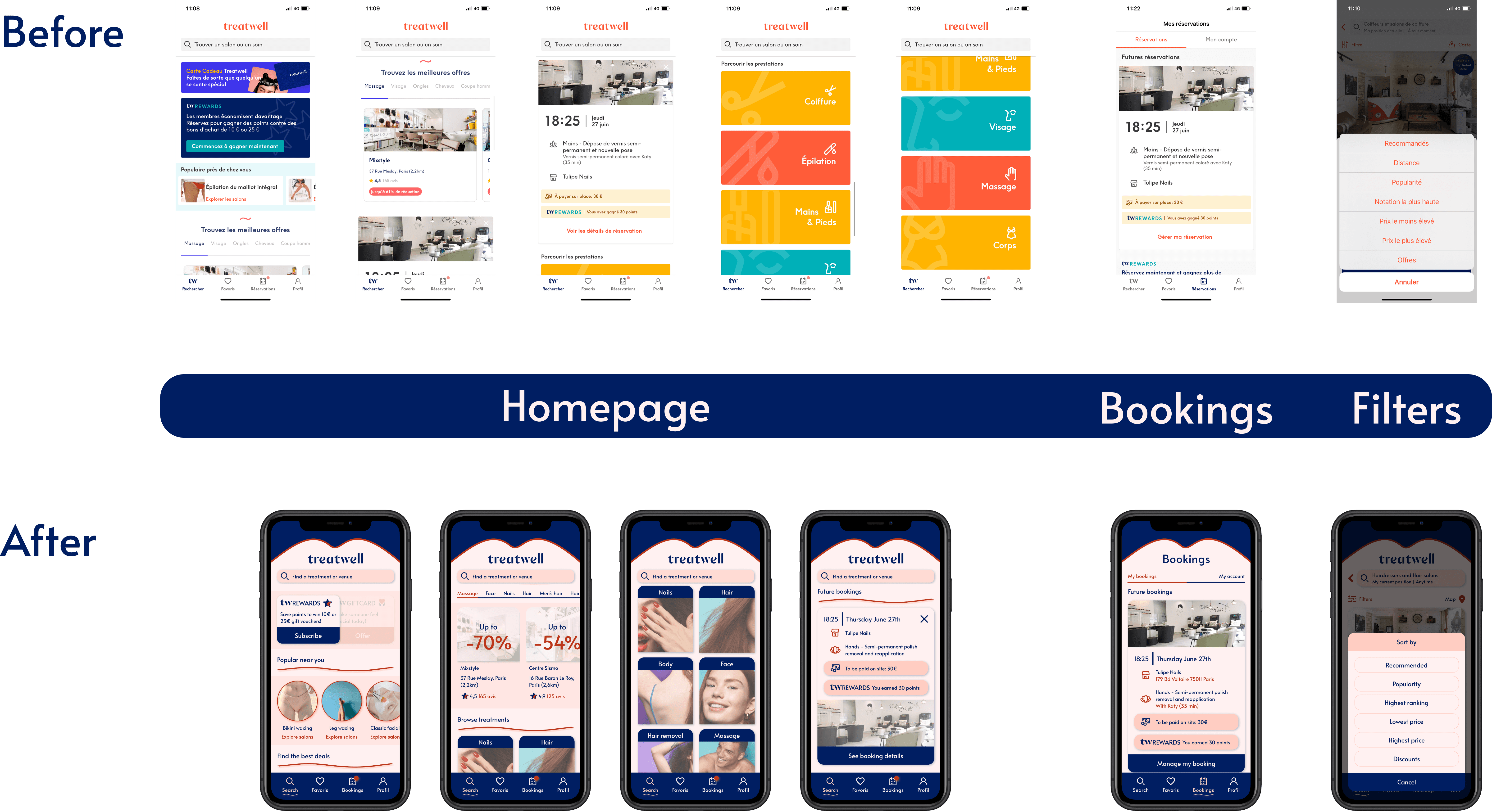
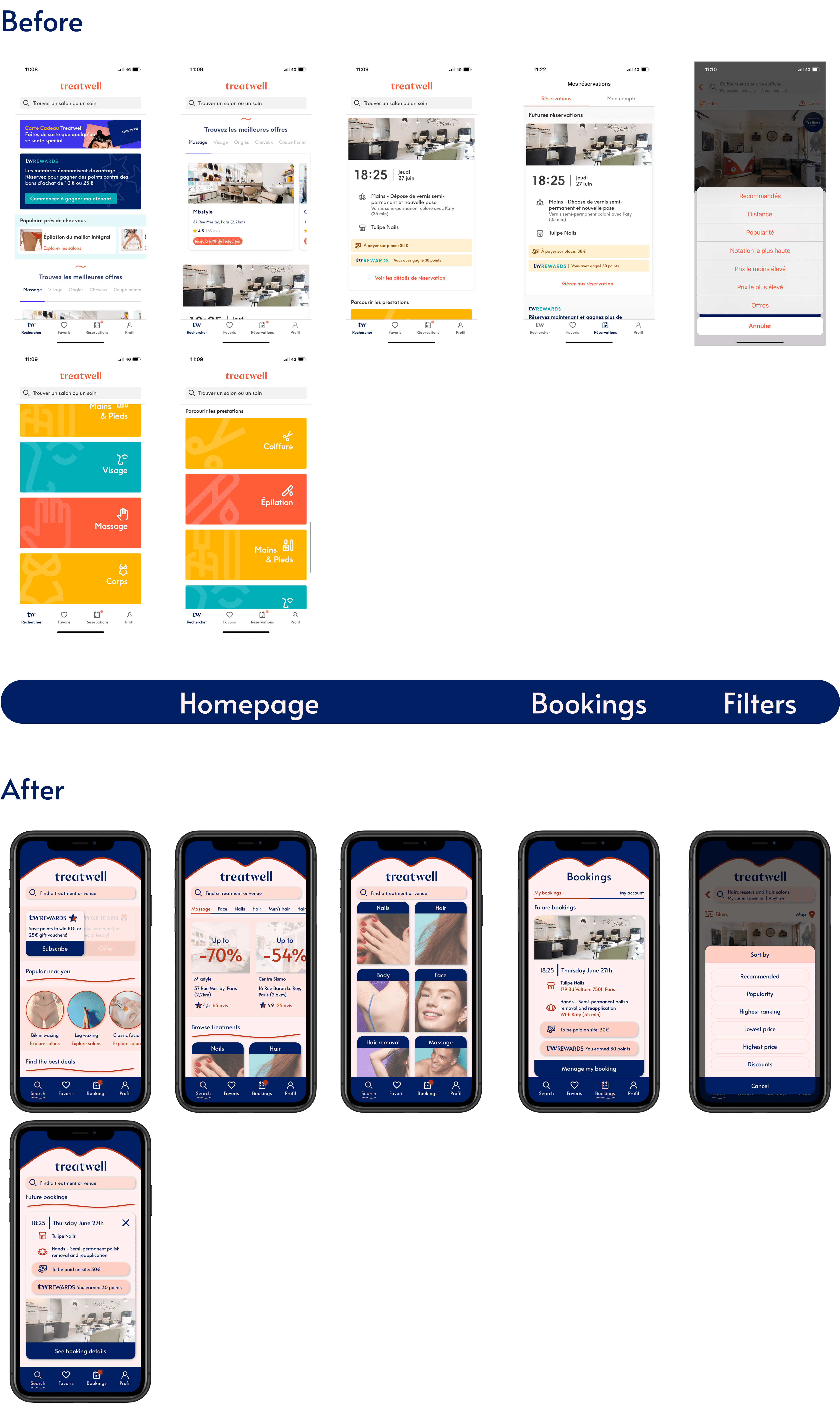
With the aim of bringing more graphic coherence and rationalizing space, I reworked the articulation of the different headings on the home page, changed the shape of certain cards to bring more roundness to the design, and reduced the size of the treatment category cards to rationalize space and reduce vertical scrolling.
I took care to improve the contrasts between text and backgrounds, photographs and call-to-action, to highlight the most important information and ease navigation. For example, on the home page I've reduced the opacity of the institute photos to emphasize the percentage discounts, and I've reorganized the appointment cards so that the “cross” CTA is no longer superimposed on the background image.
Overall, I used fewer colors, favoring more nude hues to convey naturalness. In order to convey the human, inclusive, uninhibited identity and facilitate identification by users, I also chose to integrate human photographs as close-ups in place of the icons illustrating the care categories.
Redesigned High fidelity wireframes
Interactive prototype
Learnings & Next steps
This UI challenge was an opportunity to deepen my visual design practice and explore how brand identity can be translated into a more functional, aesthetically coherent mobile experience. One of the most meaningful takeaways was seeing how a more intentional use of layout, color, and typography, can immediately improve usability, even without user research. Working within a short timeframe helped me sharpen my ability to make confident decisions quickly and prioritize visual consistency.
After the challenge, I received feedbacks from 2 teammates and 1 senior designer through a Peer design critique session :
Increasing contrasts between background colors and UI elements (such as the search bar)
Enlarging and adding vertical padding to some CTAs to improve accessibility
Extending the carousel components by removing the margins for a smoother navigation
Reworking the positioning of wave separators on the home page
Using shadows rather than strokes for UI cards
Incorporating more close-up photography for treatment categories
As I was aligned with these suggestions, I integrated these in my own way to enhance the final result. Beyond these refinements, everyone agreed that my redesign was appealing and aligned with Treatwell's brand attributes.
Looking ahead, the next steps would be :
User testing the redesigned prototype to validate assumptions and refine based on feedback
Extending the redesign to additional user flows for a more comprehensive, unified interface
Building a design system to maintain visual and functional consistency across the product
Collaborating with UX and development teams to integrate these designs within technical frameworks
Thank you for reading my case study
If you have any questions, feel free to reach!


